Problem Statement: As a growing number of men have started purchasing beauty products - previously considered a solely feminine product - there is a need for make-up that caters to the entire gender spectrum.
Research
Brand Values & Naming




Mood Boards & Colour Palettes


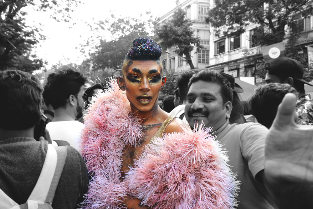
Below are some pictures taken at Pride March 2019 and Gulabi Mela 2019. Gulabi Mela is an event organised by the Humsafar Trust where LGBTQ people showcase their talents, to name a few, dancing, singing, poetry, stand-up comedy. And the evening ends with drag race. People put up stalls where they sell different things. These events made me realise, how open the LGBT people are. They had such a positive outlook and weren't afraid to show their true self, being among the people they could call their family.

Findings from Primary Research
Working on the campaigns felt more like an anger management exercise with all the scribbling on a piece of paper. Since there are at least 72 gender identities, I wanted to invoke curiosity (people questioning their own identities) and break boundaries (that all genders can use makeup). I have used makeup products instead of facial features, to indicate that gender doesn't matter when it comes to expressing ourselves.
Campaign


Gender neutrality is a purpose to stop society from distinguishing between sexes and treating everyone equally, by including everyone and not mistreating anyone because they do not meet the cultural standards set on identities and behaviours.
The purpose of the market study was to learn about different gender neutral makeup brands in the world. It was found that there are 2 brands that have launched, one in the U.S. and the other in Europe; they are Fluide and JECCA Makeup. The former brand is unique in terms of their photography and the naming of their products; whereas the latter is unique in terms of the product itself, which is not being sold by any other makeup brands.
Market research
What is gender neutrality?


Logo Explorations


With other brands targeting women, a gender-neutral cosmetic brand would be the first brand in India whose target audience would include men and LGBTQ community as well; this itself gives the first mover advantage since this concept has not been introduced to the market yet.
Below are some of the responses that was received when asked, 'what they thought if such a brand were to launch in India.

Scope

I wanted to create a gif for my logo, where a different colour is introduced with every letter of the logo. Each colour denotes some gender identity. Later, a light grey takes over all the colours, the reason behind that was 'the brand doesn't stand for a specific gender but all genders.' The reason behind using a light and dark shades of grey instead of black and white was, 'how the world is not just black and white but shades of grey, gender is not just pink (female) and blue (male) but a whole spectrum of colours.'
Out of all the name options, I was contemplating between Gen Inc. and Gen Neu. In the end I went ahead with Gen Neu, because it played well with the targeted age group, that is, 15-mid 30s. The reason behind selecting that age group was, that's the age where people are more experimental with makeup, and are more accepting & challenging towards the gender norms. There is a play of words New Generation being Gender Neutral.
This whole project has been out of my comfort zone. The topic itself was something I never imagined I'd choose; additionally, I also learnt a bit about photography (product and outdoors), visiting places alone and interacting with new people, where I ended up making new friends. I learnt how to manage my time better.
Learning Outcome
For the packaging of makeup products, I wanted to first work on the eye shadow palettes as, eyes are the most expressive feature and the brand is all about expressing themselves freely. To determine the names of the packaging, I used a branding tool, and using that, I figured that I wanted to use the Millennial/Gen Z slang, since that would be relatable with the targeted age group.
Packaging


For the packaging, I wanted it to have the attitude the palette themes required. I achieved it by using a bold brush script font and the sides have the colour texture; a hint to the range of colours one can expect in the respective palette.


Behind The Scenes


Other Projects

Identity Design

UI

Animated Illustrations